Post reply

Warning: this topic has not been posted in for at least 120 days.
Unless you're sure you want to reply, please consider starting a new topic.

Note: this post will not display until it's been approved by a moderator.

Name:
Email:
Subject:
Message icon:

shortcuts: hit alt+s to submit/post or alt+p to preview

Please read the rules before you post!


Topic Summary

Posted by: Fistandantillus7
« on: October 18, 2021, 08:14:04 AM »

As happens, it turns out systems towards the top of my map were connected to systems towards the bottom. So a major rearrangement occurred, but I simply could not get the grid lined up. Database edit time I thought. And if I am going to go to that trouble, why not experiment with something completely different: a circular grid.

Posted by: nuclearslurpee
« on: September 26, 2021, 10:12:12 PM »

1) The grid should be based on the size of the green system circle. I was going to suggest 110% of that size i.e. two systems placed one grid-point apart would have a gap of 10% the diameter. Most people would probably space systems 2 grid-points apart to allow for the infographic outer circles. Given the 20 and 140 numbers mentioned above, I'm guessing a system circle is 50 diameter with a 20 buffer giving a default 'used' grid size of 70 and a default placement of systems two grid-points apart. This is a little bigger than my off-the-top-of-my-head 110% but perfectly acceptable to me. Note though that it is impossible to place a system midway/halfway between two default placed systems as 20 does not divide 70.
The finer grid spacing allows for more creativity in arranging the map:
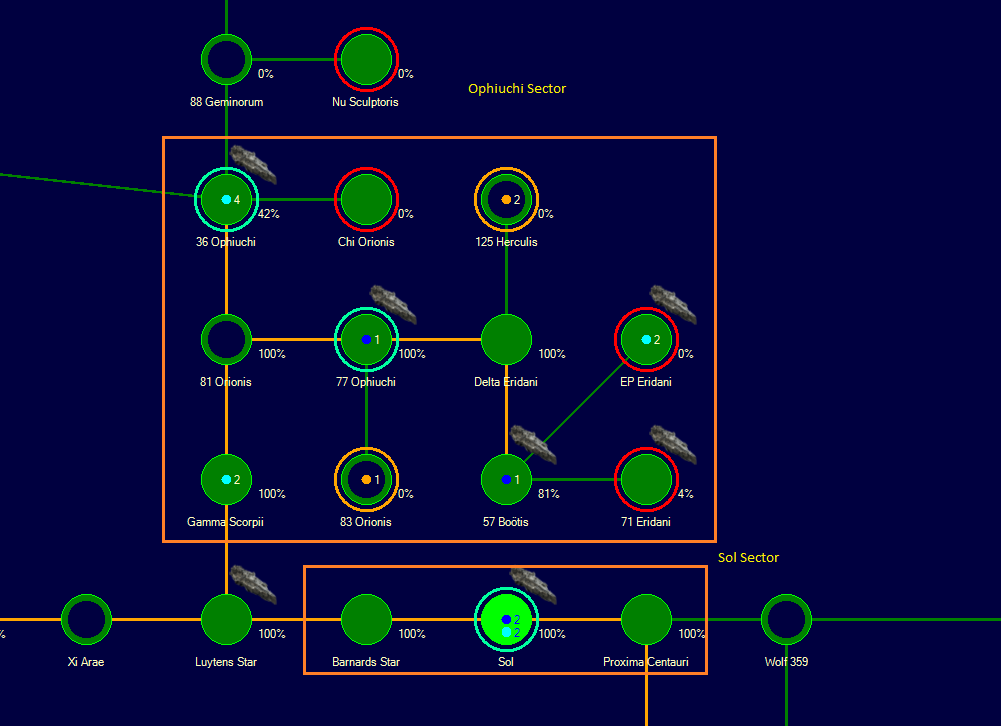
I agree db48x, but, it seems highly unlikely anyone would want systems to overlap, so a grid smaller than the diameter of a green system circle is unlikely to be necessary. A person likely might want to place a system midway between and above/below two others suggesting a grid half the size, but the reality of the space necessary to display the information the player will likely want suggests using the even grid-points for major placements and the odd grid-points for half-way. Indeed, Hex-grids like the one you have created in the screen shot you have attached can be approximated using a really simple algorithm: even columns (-2, 0, 2) use even rows (-2, 0, 2) and odd columns (-3, -1, 1, 3) use odd rows (-3, -1, 1, 3)

If I understand correctly you are proposing that we change the grid from 7x20 to 2x70 (keeping the 140 px default spacing), which I would approve of as this makes it easy to create approximately hexagonal grids.

Quote
2+3) Geo-survey status and grav-survey status are shown in completely different ways, and grav-survey info is shown multiple times. Currently a partially surveyed system shows a percentage number (that never goes away) for the geo-survey status, a red circle if the grav-survey is incomplete, an additional orange circle if jump points have been found and remain unexplored and an orange dot with the number of unexplored jump points. I suggest showing the geo- and grav- status as a counter-clockwise decreasing coloured arc proportional to what is remaining to be done. Zero system bodies geo-surveyed show a complete (red?) circle. 42% geo-survey complete, show an arc from 12 to 7 (210°). Similar for grav-survey status: zero done complete (orange?) circle, 17 of 30 points surveyed a 156° arc. The orange dot with number for unexplored jump points.

Personally I prefer the geo survey to be shown the way it is as it is simple to tell which is grav and which is geo. Using another colored ring would make this a bit harder to tell and we already have a lot of rings with similar colors so it would be difficult to find one which is not similar to another. I do like the idea of a progress indicator for grav surveys on the ring.

Quote
5) Ctrl-click on a system on the galaxy map to go to the system map for that system. Ctrl-click on the galaxy map icon to go to the galaxy map with the current system highlighted (rather than Sol).

Ctrl+Click (and drag) is already used in the galaxy map to drag multiple systems, so this would not work. Shift+Click is also taken for multiple selection. Possibly Alt+Click? I don't think this does anything currently.

The latter suggestion should IMO be the default behavior as it is usually what I want when I click the galaxy map. However a Ctrl+Click should be fine as well.
Posted by: Fistandantillus7
« on: September 26, 2021, 09:33:36 PM »

I was going to create a topic with basically some version of all the suggestions made here but the search function lead me to add to this old one.

1) The grid should be based on the size of the green system circle. I was going to suggest 110% of that size i.e. two systems placed one grid-point apart would have a gap of 10% the diameter. Most people would probably space systems 2 grid-points apart to allow for the infographic outer circles. Given the 20 and 140 numbers mentioned above, I'm guessing a system circle is 50 diameter with a 20 buffer giving a default 'used' grid size of 70 and a default placement of systems two grid-points apart. This is a little bigger than my off-the-top-of-my-head 110% but perfectly acceptable to me. Note though that it is impossible to place a system midway/halfway between two default placed systems as 20 does not divide 70.
The finer grid spacing allows for more creativity in arranging the map:
I agree db48x, but, it seems highly unlikely anyone would want systems to overlap, so a grid smaller than the diameter of a green system circle is unlikely to be necessary. A person likely might want to place a system midway between and above/below two others suggesting a grid half the size, but the reality of the space necessary to display the information the player will likely want suggests using the even grid-points for major placements and the odd grid-points for half-way. Indeed, Hex-grids like the one you have created in the screen shot you have attached can be approximated using a really simple algorithm: even columns (-2, 0, 2) use even rows (-2, 0, 2) and odd columns (-3, -1, 1, 3) use odd rows (-3, -1, 1, 3)

2+3) Geo-survey status and grav-survey status are shown in completely different ways, and grav-survey info is shown multiple times. Currently a partially surveyed system shows a percentage number (that never goes away) for the geo-survey status, a red circle if the grav-survey is incomplete, an additional orange circle if jump points have been found and remain unexplored and an orange dot with the number of unexplored jump points. I suggest showing the geo- and grav- status as a counter-clockwise decreasing coloured arc proportional to what is remaining to be done. Zero system bodies geo-surveyed show a complete (red?) circle. 42% geo-survey complete, show an arc from 12 to 7 (210°). Similar for grav-survey status: zero done complete (orange?) circle, 17 of 30 points surveyed a 156° arc. The orange dot with number for unexplored jump points.

4) Jump point stabilization status. It would be nice if when you stabilize one side of a jump point, half of the line (from the system with the stabilized end to the centre point) on the galactic map turns orange (maybe with an arrow head?).

5) Ctrl-click on a system on the galaxy map to go to the system map for that system. Ctrl-click on the galaxy map icon to go to the galaxy map with the current system highlighted (rather than Sol).
Posted by: db48x
« on: June 27, 2021, 02:46:15 AM »

I find the galactic map rather frustrating to use, and the impression I've gotten here is that I'm not the only one. I think there are a couple ways the galactic map could be improved, some of which I think would be fairly easy to implement:
  • Wider grid spacing. Currently I find it very easy to accidentally misalign different parts of the map because the gaps between the points on the grid are very small. Put another way, there
The finer grid spacing allows for more creativity in arranging the map:


  • Better grid snapping. To be honest I can't quite figure out what algorithm is being used to snap systems to the grid: sometimes it seems to be rounding to the nearest grid point, other
    times it seems to be rounding down, moving the system in the direction of the starting
Agreed. No matter how far apart the grid spacing is, the ideal way to do it is to have the map update live, as you drag things around. This requires a decent frame rate, and that requires a somewhat different mindset to achieve. Instead of dragging a system and then clicking a button to snap everything into place, the drag and drop system should update the map continuously, with the system already snapped into place. This gives the user a feedback mechanism that allows them to naturally adjust the system into the place they want it to be in one motion.

[/list]
Posted by: Migi
« on: June 24, 2021, 04:58:30 PM »

I would love a "find system" feature on the galactic map, I had a lot of problems finding systems in my last game.

I have a other maps suggestion. I come to realize this with my biggest empire yet finding a system can be hard. I know were are my colonies but if something happen to one of my exploration ship I probably don't know were the system is and I have to look at all the map.

It would be nice to have a research tool in the galactic maps, it could center the maps on the system you are looking for.

Not to say this isn't a good idea, but if you need to find a specific ship you can select it (or its fleet) in the Fleet Organization window with the checkbox to center the tactical map on the selected fleet enabled.
I think this only helps you by going to the fleet in the system map, I don't think it does anything with the galactic map.
It would be nice to have an option to 'zoom to' or highlight the system on the galactic map when they are selected in the naval screen, or the system map.
Posted by: TMaekler
« on: June 24, 2021, 04:57:02 AM »

Nevertheless a "find it" field so search for systems might be useful.
Posted by: nuclearslurpee
« on: June 22, 2021, 01:37:18 PM »

I have a other maps suggestion. I come to realize this with my biggest empire yet finding a system can be hard. I know were are my colonies but if something happen to one of my exploration ship I probably don't know were the system is and I have to look at all the map.

It would be nice to have a research tool in the galactic maps, it could center the maps on the system you are looking for.

Not to say this isn't a good idea, but if you need to find a specific ship you can select it (or its fleet) in the Fleet Organization window with the checkbox to center the tactical map on the selected fleet enabled.
Posted by: Norm49
« on: June 22, 2021, 01:27:46 PM »

I have a other maps suggestion. I come to realize this with my biggest empire yet finding a system can be hard. I know were are my colonies but if something happen to one of my exploration ship I probably don't know were the system is and I have to look at all the map.

It would be nice to have a research tool in the galactic maps, it could center the maps on the system you are looking for.
Posted by: TMaekler
« on: June 08, 2021, 05:11:53 AM »

  • Implement zooming. This one is pretty clear I think -- maps grow beyond what can fit on one screen very quickly, and it would be much easier to make sense of the map if we could zoom out.
Supported 100%.

Additionally if Steve could add an option to "Save Galactic Map to File" would also be great instead of having to stitch several screenshots together.
Posted by: Garfunkel
« on: May 30, 2021, 02:51:28 PM »

an option to use the largest colony in the system as the starting point, rather than the primary star.
It should actually default to that even if orbital mechanics make it a dynamic distance rather than a fixed one.
Posted by: Migi
« on: May 29, 2021, 03:04:55 PM »

I would like to be able to see the grid that it is snapping to, I think that would be very helpful.
Also in VB you could change the spacing of the grid, I would like it if that was added.

Also I find the way selection/deselection works to be very unintuitive. I don't have Aurora over here (stupid tiny monitors) so I can't describe exactly what the current behaviour that bothers me so much.
Also IIRC you can't select a planet and labels at the same time, which is a problem if you need to re-arrange large portions of the map after you spent ages noting which planets/jump lanes have sensor bouys.

I would love it if the calculation of distance between systems was improved in two ways:
1) Take into account Lagrange points.
2) In cases where multiple routes are possible, display the distance of the shortest possible route, not the distance of the route with the fewest hops.
I would like these as well, and also an option to use the largest colony in the system as the starting point, rather than the primary star.
Posted by: Norm49
« on: May 25, 2021, 11:33:46 AM »

One thing i would like. I may be the only one is being able to make line.

Let say i use it to make a square around some system then use the labelling to mark this is the Sirius sector.

This is a fast example I made using snipping tool and paint.

Posted by: nuclearslurpee
« on: May 24, 2021, 05:23:33 PM »

For those not already aware, the grid snapping is done in increments of 20. I don't know what this is 20 of, perhaps pixels, but it is 20 if I remember correctly.

When a new system is discovered it is placed, if possible, with a delta-x and delta-y from the connecting system of 140 or a multiple thereof. In other words the default spacing between systems is seven grid lines, a very strange number.

Given that most folks seem to not care much for the fineness of the current grid, I might suggest that the grid snapping be changed so that grid lines are spaced by 70 pixels. This would make a new system spacing of only two grid lines, easy to work with, and the intermediate grid lines can be used for a passable imitation of a triangular/hexagonal arrangement.
Posted by: Zap0
« on: May 24, 2021, 03:28:40 PM »

Agree that the most critical improvement for the galactic map is a wider grid spacing and ideally some improved snapping. The snap always seems to move the system to the bottom right. The grid spacing used to be configurable in VB6, which was of relatively dubious advantage, so I'm not too sad to see the option gone. But for clarity and sanity I prefer the distances between systems to be equal, and the current rather fine grid makes that difficult. I keep a ruler around to hold to my screen and judge if I've spaced the systems correctly.
Posted by: Jeltz
« on: May 24, 2021, 11:42:36 AM »

If the System Map is the heart of Aurora then the Galactic Map should be the brain

I think the GalMap as a sort of strategic map, then it should have:

(only some ideas)

- zooming
- better snapping
- double click on a system open the corresponding SysMap, or if the SysMap is already open, then this focusing on the selected system
- improved labeling
- thematic coulored filters (distance, minerals, hostiles, troops, fleets mil/civ, ...)
- ...

J.