Ok, I think the reason I failed at graphs last time was because I was trying to show too much information on the same graph.
So, here is Try #2:
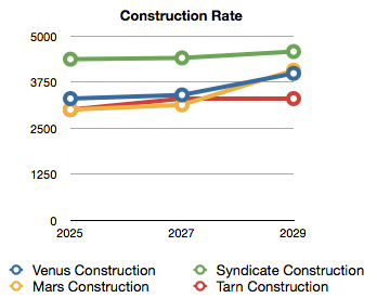
Option 'A'. Graph by sub category. Sort of what I was trying to do before, but with only one line per faction. Trying to graph everything this way every update would take up too much space, so I'd either have one Statistics thread stuffed with everything, or else only post two or three new graphs with each AAR update.
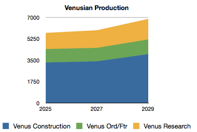
Option 'B'. Graph by Race. This make comparison between races harder, but makes racial changes easier to see. Likely I'd create one Facts-page per faction that contains all known ship designs and production trends. Or those of you running race specific AARs could copy the image links and stick them there.
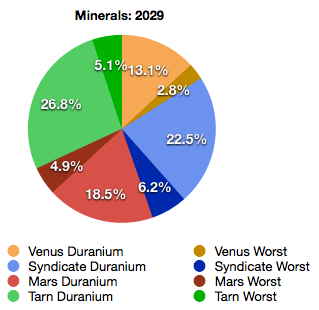
Option 'C'. The pie-chart does a nice job at showing relative production across multiple categories and races, but gives up the historic trend data that the other options show.
And there is Option 'D'.
A PDF of the raw table data as an attachment.
Any thoughts on what should be my primary AAR production report formate, and what/if I should periodically include for secondary information?


